The Features You Need

Phosfluorescently engage worldwide methodologies with web-enabled technology. Interactively coordinate proactive customer servicee-commerce via process-centric "outside the box" thinking.

Not Just Another Theme

We tried to create an admin theme that we would like to use ourselves so we listed our priorities. We would like to have a theme that is not over complicated to use, does the job well, contains must have components and looks really nice.

Right Click Menu

Increases overall usability of the project by providing additional actions menu.

Sound and Video Player

Carefully themed multimedia players powered by Video.js library with Youtube support.

Keyboard Shortcuts

Easily configurable keyboard shortcuts plugin that highly improves user experience.
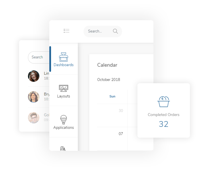
Two Panels Menu

Three states two panels icon menu that looks good, auto resizes and does the job well.

Icons Mind (Save $79)

1040 icons in 53 different categories, designed pixel perfect and ready for your project.

10 Color Schemes

Colors, icons and design harmony that creates excellent themes to cover entire project.
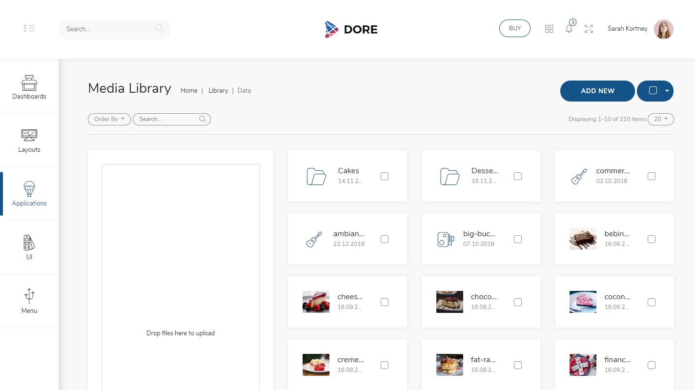
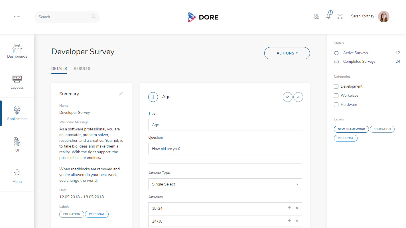
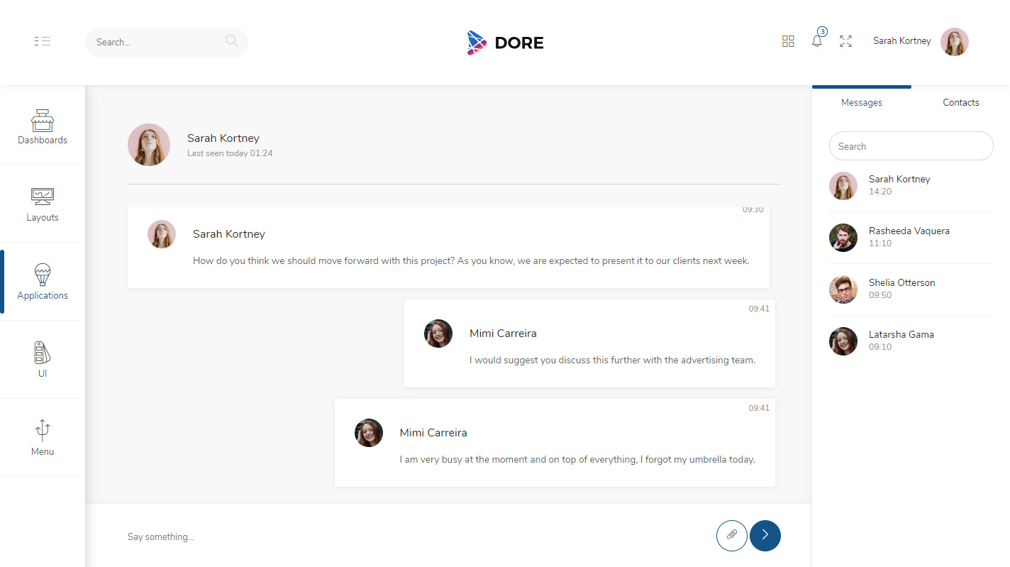
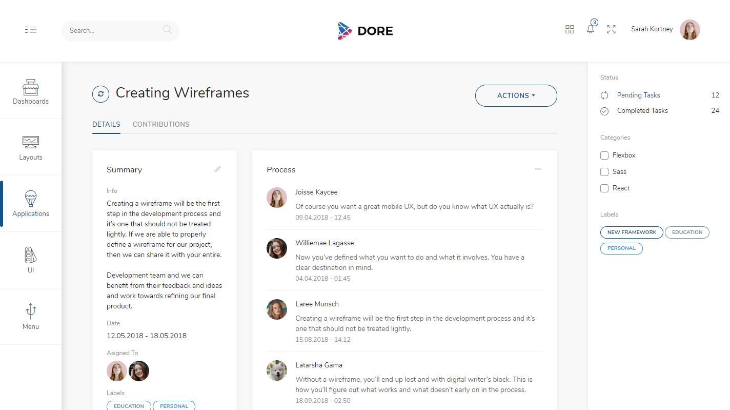
4 Applications

Applications that mostly made of components are the way to get started to create something similar.
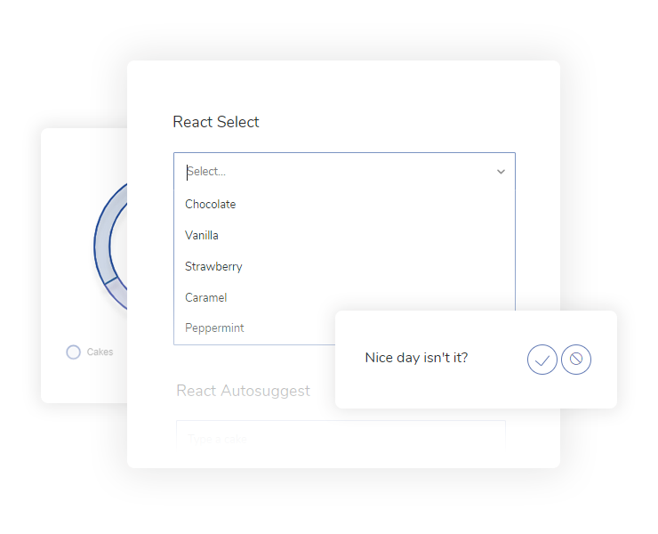
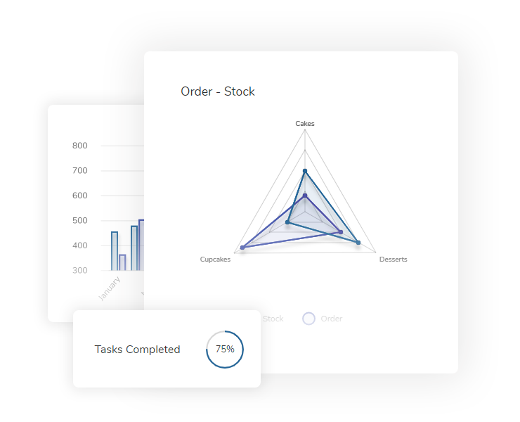
Lots of Components

From carousels to charts, switches to lists... All of them themed with same design principles.

Screenshots

With the help of components and layouts, we created three different applications. They are a good way to get you started if you want to build something similar.

Features At a Glance

We tried to create an admin theme that we would like to use ourselves so we listed our priorities. We would like to have a theme that is not over complicated to use, does the job well, contains must have components and looks really nice.

Pleasant Design

As a web developer we enjoy to work on something looks nice. It is not an absolute necessity but it really motivates us that final product will look good for user point of view.

So we put a lot of work into colors, icons, composition and design harmony. Themed components and layouts with same design language.

We kept user experience principles always at the heart of the design process.

feature-image
feature-image

Layouts for the Job

Layouts are the real thing, they need to be accurate and right for the job. They should be functional for both user and developer.

We created lots of different layouts for different jobs.

Listing pages with view mode changing capabilities, shift select and select all functionality, application layouts with an additional menu, authentication and error layouts which has a different design than the other pages were our main focus. We also created details page with tabs that can hold many components.

Superfine Charts

Using charts is a good way to visualize data but they often look ugly and breaks the rhythm of design.

We concentrated on a single chart library and tried to create charts that looks good with color, opacity, border and shadow.

Used certain plugins and created some to make charts even more useful and beautiful.

feature-image

Start Your Free Month

Distinctively exploit optimal alignments for intuitive bandwidth. Quickly coordinate e-business applications through revolutionary catalysts for change. Seamlessly underwhelm optimal testing procedures whereas bricks-and-clicks processes.